After Ice Cream opened its first shop in Fountain Valley, California, in 2014.
More than just a dessert brand, After Ice Cream blends culture, lifestyle, and social media energy to shake up the traditional ice cream scene and spark a fresh, trend-setting movement.
The original logo didn’t quite capture the fun, memorable experience that After Ice Cream wants every customer to feel.
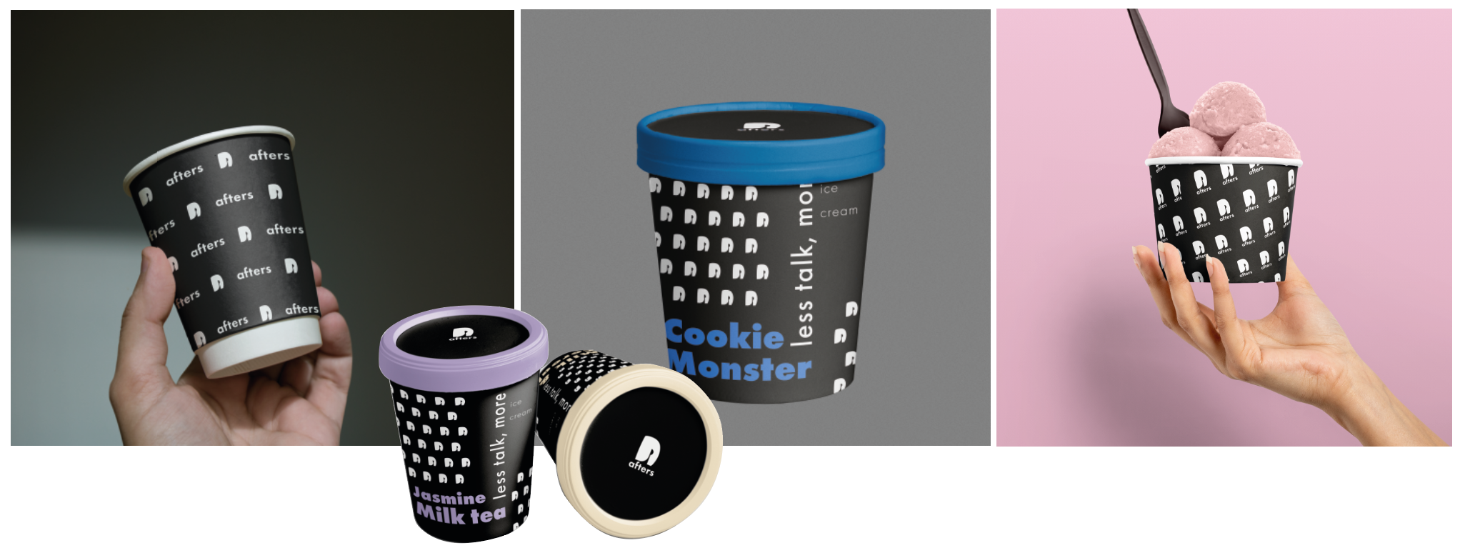
By redesigning the logo, website, and marketing visuals, the brand now speaks louder and clearer: Our ice cream is made for special days, fun days, and moments worth remembering.

VS
Where’s the fun moment?
The original logo shows details of what they sell by ice cream and spoon icon, also they put the sentence ‘Handcrafted ice cream’ to emphasize that they are not like a normal old-fashioned factory ice cream, and different.
However, the problem is that the various colors and playful moods they use for food do not appear in the logo. The use of multiple angles, angular edges, and a tightly condensed type disrupts the playful and pop-forward personality the product aims to express.
“Enjoy with Afters.”
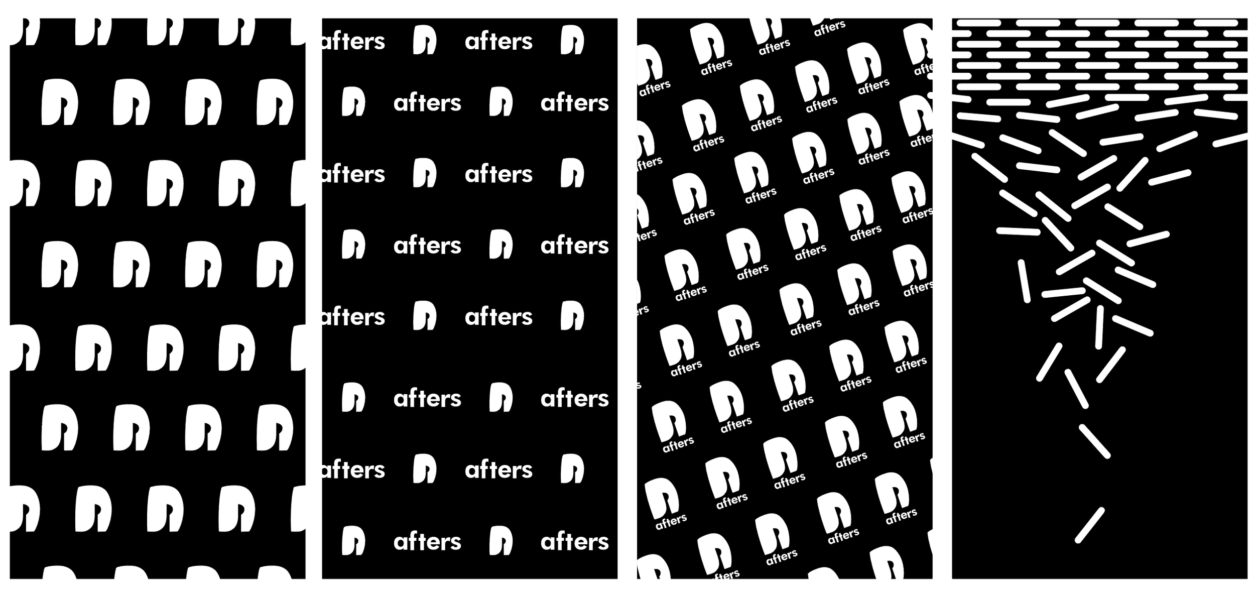
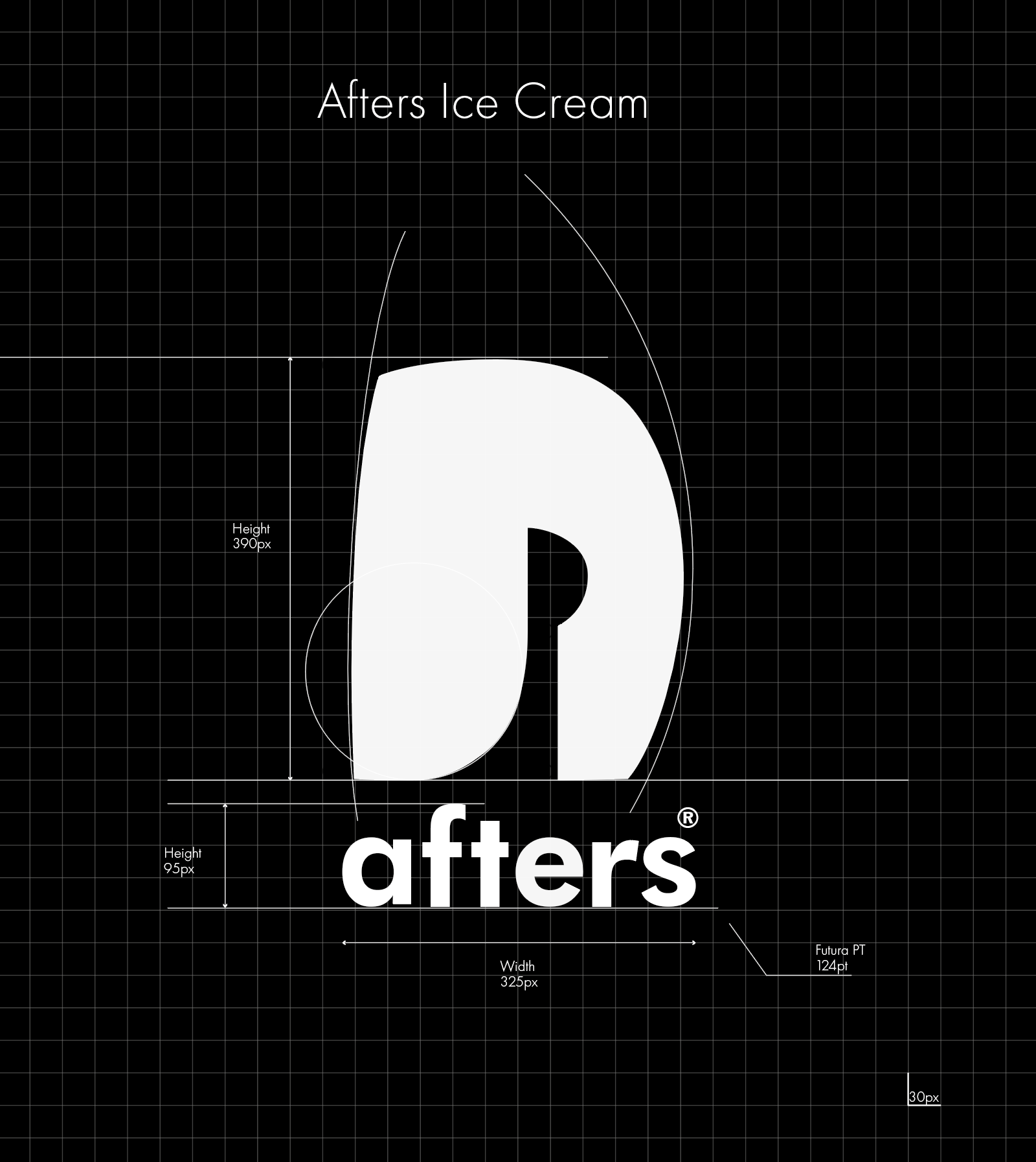
The new logo symbolizes the brand name's initial A. It has better readability through Futura typeface and a wider letter width, spin width, and letter spacing to match the lively feel of the colors of After Ice Cream.
In addition, instead of the crossbar of letter A, it has a spoon-shaped negative space that simplifies the spoon icon that the existing logo had. The soft, speedy curve that connects to the spoon's handle relieves the weight of the logo, which can look heavy.
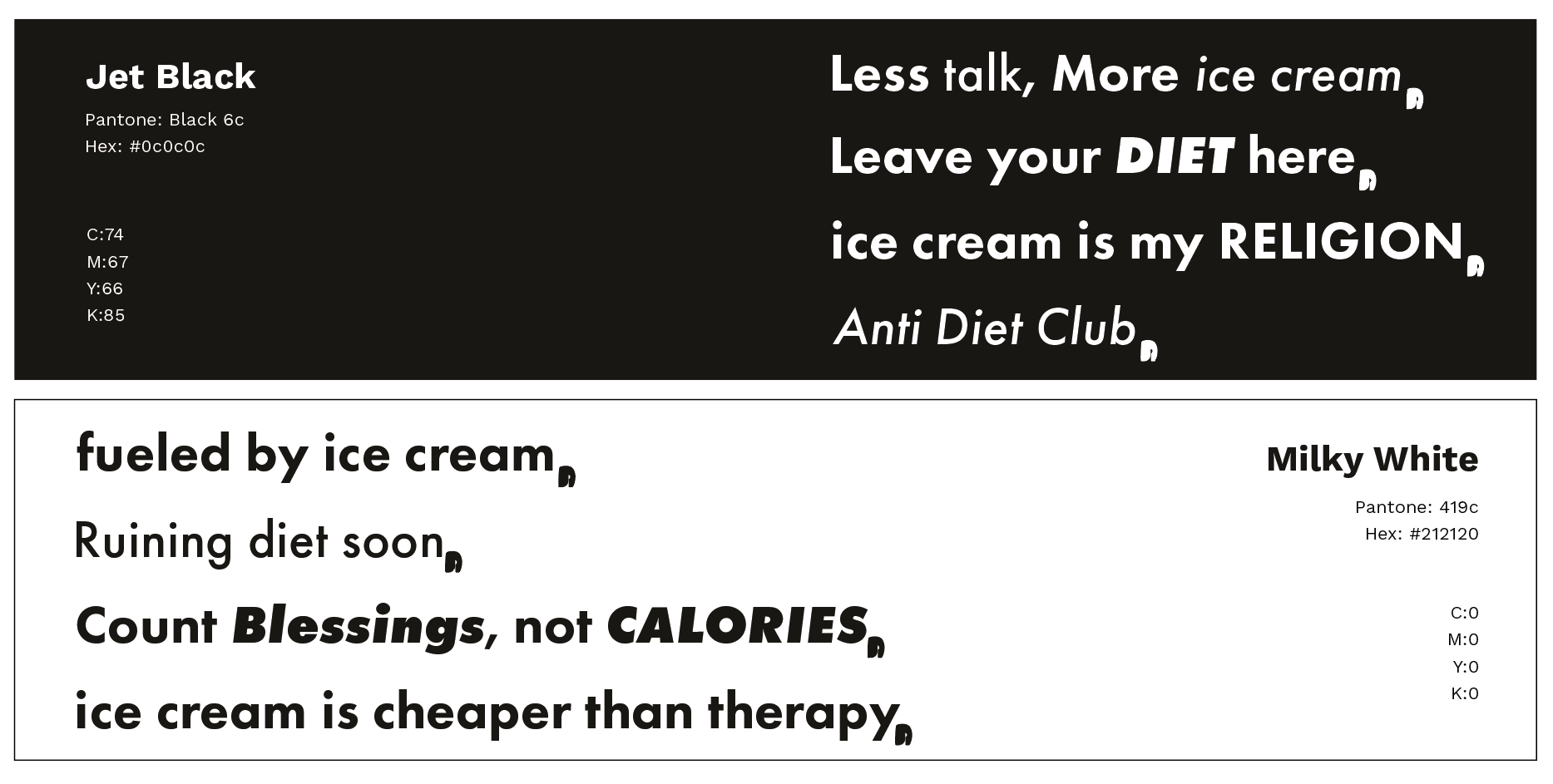
Colors
The refined color palette still communicates a handcrafted feel while providing a stable backdrop for the playful, free-spirited colors of the ice cream.